
Neuro-Aesthetics
Calming Wall Art and Neuroaesthetics: How Color, Nature, and Scale Shape a Restorative Home
The art on your walls is not only decorative. It shapes the feeling of the room. Learn how color psychology, biophilic design, soft light, visual depth, and proper placement can help create a calmer home environment.
Every time your eyes move across a painting, your brain is processing color wavelengths, evaluating spatial depth, scanning for threats, and triggering hormonal responses — all before you consciously register what you are looking at. A chaotic, high-contrast image activates your sympathetic nervous system. A calm, horizon-rich landscape does the opposite.
This is more than a decorating metaphor. Environmental psychology and neuroaesthetics suggest that visual surroundings can influence attention, emotional tone, and perceived safety. Nature-based imagery, soft color, and open depth cues may help a room feel less visually demanding and more restorative.
The practical question is simple: does your wall art make the room feel more settled, or does it add visual noise?
Key Mechanisms
-
Chromotherapy: Specific light wavelengths directly influence the hypothalamus.
-
Vagal Tone: Deep horizon lines and 'safety cues' stimulate the vagus nerve.
-
Biophilia: Simulating natural depth restores directed attention capacity.
Quick Answer
Calming wall art usually works best when it combines soft color, natural subject matter, visual depth, and low glare. Look for sage, blue-green, misty blue, warm neutral, water, forest, meadow, sky, or horizon-rich scenes. Then display the print at the right scale, usually large enough to feel like a visual anchor, and choose a matte finish to avoid distracting glare.
How art lowers cortisol: the chromotherapy mechanism
Cortisol is your body's primary stress hormone. In short bursts, it is useful. Chronically elevated — as it is for most people living in visually overstimulating modern environments — it disrupts sleep, raises blood pressure, impairs memory, and accelerates aging.
Color is one of the fastest inputs to the stress system. Specific wavelengths of visible light reach the hypothalamus via the retinohypothalamic tract — a direct neural pathway that bypasses conscious thought entirely. This is why you can feel calmer walking into a room painted in cool blue-green before you have had a single thought about the room.
For wall art, the colors most often used in calming interiors are:
- Cool blues and blue-greens (wavelengths 490–520nm) — associated with open water and sky, evolutionarily linked to safety and resource availability
- Soft greens and sage (wavelengths 520–560nm) — the dominant color of vegetation, triggering what researchers call the "safety signal" in the autonomic nervous system
- Muted neutrals with warm undertones — ochre, warm taupe, and burnt sienna at low saturation create psychological warmth without visual stimulation
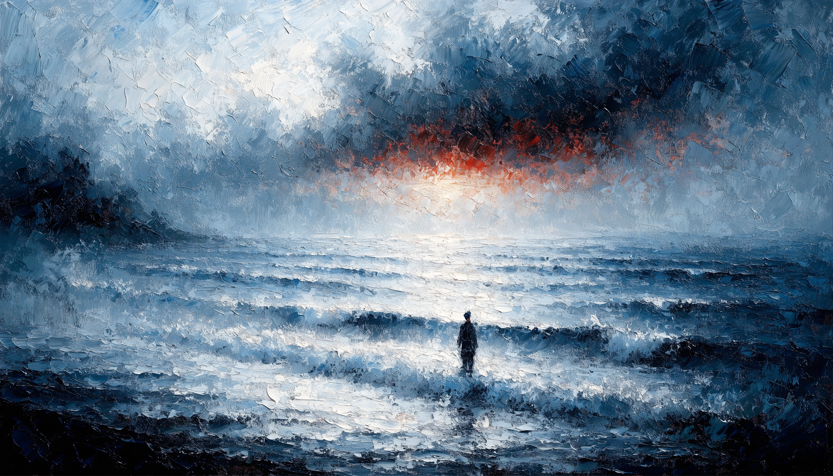
High-saturation reds, electric yellows, and sharp graphic contrasts do the opposite — they are visually alerting colors that can make a room feel more energized. Beautiful in some contexts. Not what you want on the wall above your sofa at 9pm.
Go deeper: Chromotherapy at Home — How Art Colors Lower Cortisol
The vagus nerve and visual safety cues
Your vagus nerve is the longest cranial nerve in your body, running from your brainstem to your abdomen and regulating your heart rate, digestion, and overall state of calm. High vagal tone — meaning your vagus nerve is active and well-regulated — is strongly correlated with resilience, emotional stability, and physical health.
One of the most underappreciated activators of the vagus nerve is visual input that your nervous system interprets as "safe."
Evolutionary psychology identifies specific visual cues that trigger this safety response:
- Open horizons — distant views without obstacles, suggesting escape routes are available
- Soft, diffuse light — indicating non-threatening time of day (dawn or dusk rather than harsh midday)
- Water — historically the single most important resource, its presence signals safety at a deep biological level
- Gentle implied motion — windblown grass, rippling water, drifting clouds
Landscape art that contains these elements — a misty lake at dawn, a wide meadow at golden hour, a forest path leading to an open clearing — is not just beautiful. It is actively communicating safety to your nervous system through your eyes.
This is why a well-chosen landscape print does something that a blank wall, a geometric pattern, or an abstract print with sharp contrasts cannot: it gives your nervous system something to settle into.
Go deeper: Visualizing Safety — Art and the Vagus Nerve
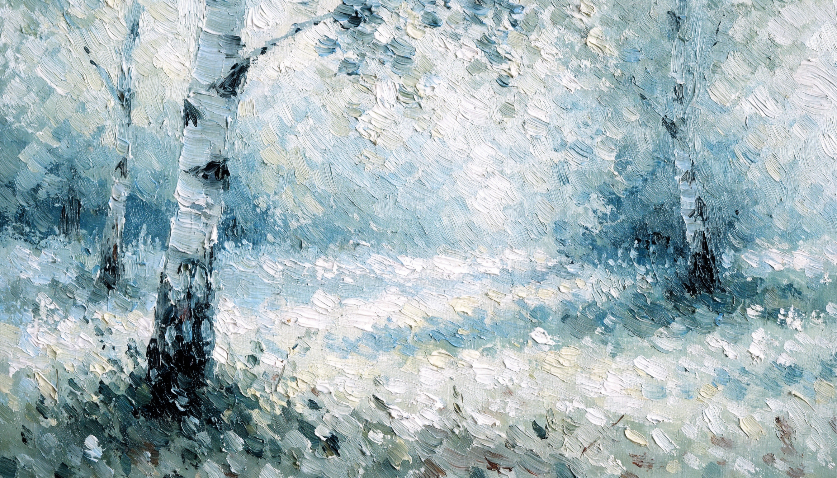
Biophilic art: why nature scenes work differently to other images
Biophilic design is the practice of incorporating nature into built environments to satisfy our innate biological need for connection with living systems. Humans evolved in nature over hundreds of thousands of years. We have spent approximately 200 years in predominantly indoor, nature-depleted environments. Our nervous systems have not caught up.
Research from the field of environmental psychology — including the landmark work of Rachel and Stephen Kaplan on Attention Restoration Theory — shows that natural environments (and representations of natural environments) replenish directed attention capacity in ways that urban scenes and abstract imagery do not.
In practical terms: a view of nature, or an image of nature, restores the mental resource you deplete every time you focus, resist distraction, or make a decision. It is one of the few genuinely restorative visual inputs available to people who spend most of their time indoors.
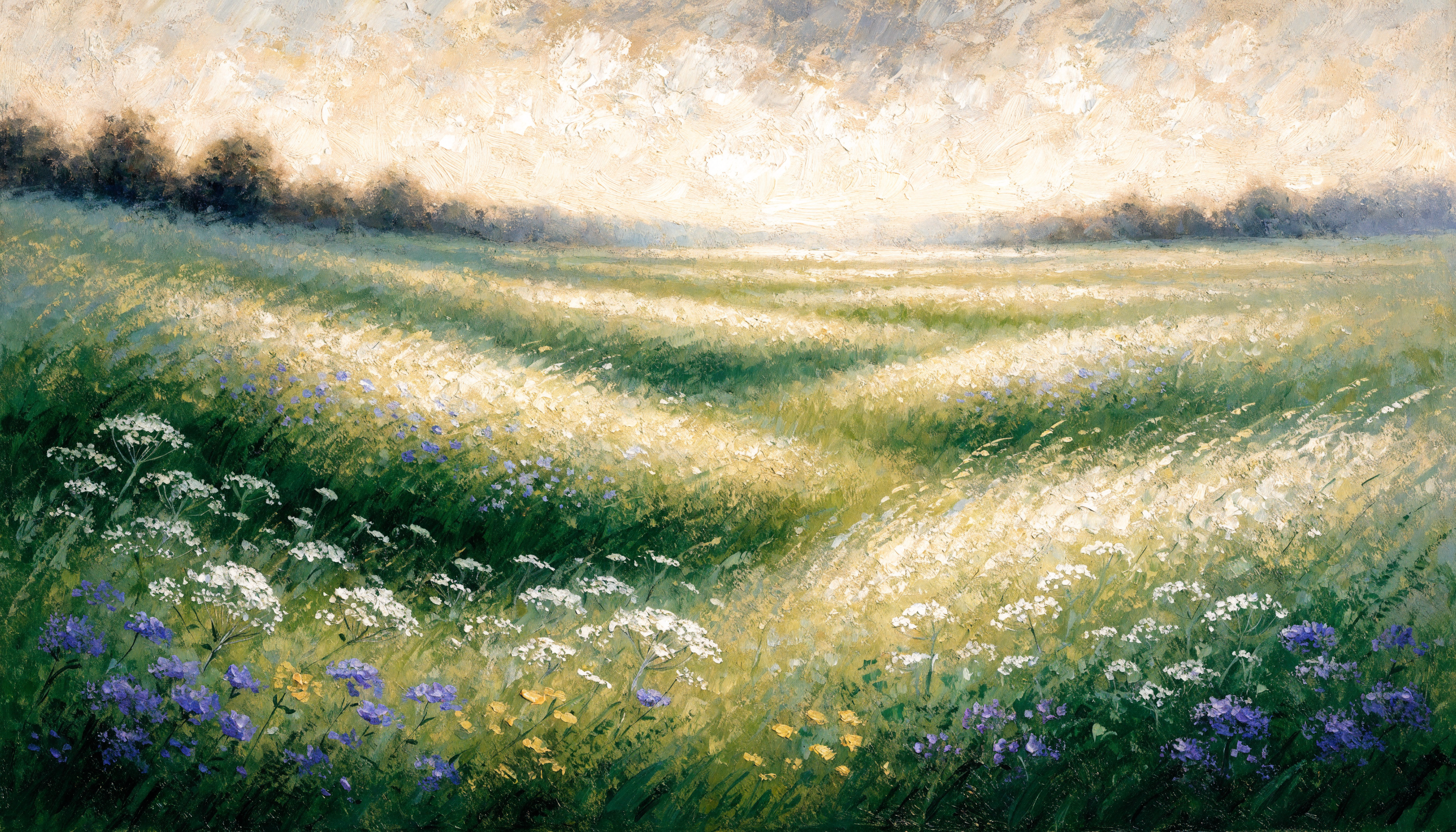
For wall art, the most effective biophilic subjects are:
- Forests and woodland scenes — particularly with layered depth (near/mid/far ground planes)
- Water landscapes — lakes, rivers, coastal scenes with visible horizons
- Open meadows and fields — especially with sky taking up 40–60% of the composition
- Sky-dominant compositions — dawn and dusk skies, cloud formations, moonlit scenes
The key attribute in every case is depth — a clear foreground, midground, and background that invites the eye to travel into the image. Flat compositions, even of natural subjects, do not produce the same restorative effect.
Go deeper: Biophilic Design Explained — Green Wall Art and Nature Benefits | The Forest Bathing Aesthetic
Room-by-room calming art map
The same artwork can feel different depending on the room. Start with the emotional job of the space, then choose color, subject, and scale around that goal.
| Room | Best Feeling | Art Cues to Look For | Helpful Next Guide |
|---|---|---|---|
| Bedroom | Restful, quiet, safe | Misty water, moonlight, sage, soft blue, low contrast | 57-inch hanging rule |
| Living room | Open, grounded, welcoming | Horizon lines, forests, fields, warm neutrals, gentle depth | 2/3 sizing rule |
| Home office | Focused, clear, low-distraction | Muted greens, slate, soft landscapes, quiet architectural depth | Color psychology guide |
| Reading nook | Soft, absorbed, restorative | Forest paths, water, low-saturation botanical forms | Finish guide |
Size, viewing distance, and placement
The physiological effect of wall art is significantly modified by its size relative to your viewing distance. A 12x16 print seen from 10 feet away barely registers as a visual anchor. A 24x36 print at the same distance occupies roughly 15 degrees of your visual field — enough to genuinely immerse you in the scene.
Research on immersive art experiences suggests that images occupying more than 10–12 degrees of visual field begin to activate the same neural circuits as actually being in the environment depicted. Below that threshold, the brain processes the image as an object in the room rather than a view into a space.
The practical rule: the print should feel like a window, not a photograph.
For most living rooms and bedrooms, this means:
- Above a sofa (6–8 feet viewing distance): minimum 24x36, ideally 30x40 or larger
- Above a bed (4–5 feet viewing distance from lying position): 18x24 minimum, 24x36 ideal
- Home office accent wall (6–10 feet viewing distance): 20x30 to 24x36
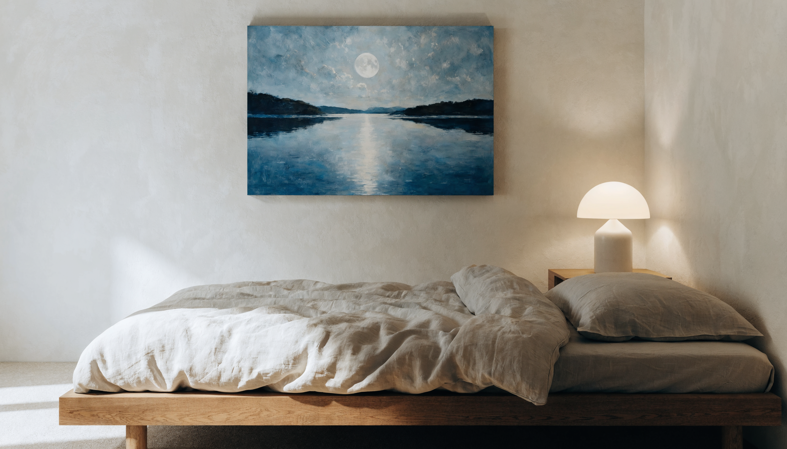
Placement matters equally. Hang the print so its center sits at eye level when you are in the position you occupy most in that room — seated on the sofa, lying in bed, sitting at a desk. Art hung too high feels disconnected. Art hung at the right height becomes part of the room's felt environment.
Go deeper: Sizing for Serenity — The Science of 24x36 Bedroom Art
Calming wall art checklist
Use this simple checklist before choosing art for a room where you want a calmer atmosphere.
| Element | Calming Choice | Usually Avoid for Restful Rooms |
|---|---|---|
| Color | Sage, blue-green, misty blue, warm taupe, sand | Neon tones, sharp red/yellow dominance |
| Subject | Water, forest, meadow, sky, distant horizon | Crowded scenes, chaotic movement, aggressive contrast |
| Composition | Clear foreground, midground, and background | Flat, compressed scenes with no visual depth |
| Finish | Matte, low-glare surface | Glossy surfaces that reflect windows and lamps |
| Print quality | Cotton rag paper and pigment ink | Thin poster paper and cheap dye ink for long-term display |
How to choose calming art for your space
The most important question is not "do I like this image?" It is "how does this image make my body feel?"
Before purchasing, spend 30 seconds looking at the piece. Notice whether your breathing slows or shallows. Notice whether your shoulders drop or tighten. Your autonomic nervous system will give you the answer before your conscious mind does.
Beyond that felt sense, look for these specific qualities:
- Color: Dominant cool or muted warm tones. Avoid high-saturation primaries or sharp graphic contrast unless you want the room to feel activating rather than calming.
- Depth: Clear foreground, midground, and background. The eye should be invited to travel into the image.
- Light source: A single, natural light source — morning sun, moonlight, dusk glow. Multiple competing light sources create visual tension.
- Subject: Nature subjects, open horizons, water, or soft implied human presence (a distant figure, a lit window in a landscape). These activate safety circuitry.
- Finish: Matte. Always matte for large wall art in living spaces. Gloss creates specular reflection — mirror-like hotspots that literally compete with the image for your attention and undermine the calming effect entirely.
Curate your visual environment for peace. Browse our full collection of calming fine art prints.
Frequently asked questions
What kind of wall art feels most calming?
Nature-based art with soft color, open depth, gentle light, and a low-glare matte finish often feels the calmest in living rooms, bedrooms, and reading spaces.
Can wall art reduce stress?
Wall art is not a medical treatment, but visual surroundings can influence the feeling of a room. Many people find that nature imagery, low-contrast color, and uncluttered composition help a space feel calmer.
What colors are best for calming wall art?
Soft blue, blue-green, sage, muted green, warm taupe, ochre, sand, and low-saturation earth tones are strong choices for calming wall art.
What size should calming bedroom art be?
For many bedrooms, 18x24 works on smaller walls, while 24x36 is a stronger anchor above a bed. Use the wall width, furniture width, and viewing distance as your guide.
Is matte or glossy better for calming wall art?
Matte is usually better because it reduces glare. Glossy finishes can reflect windows and lamps, adding visual noise that competes with the artwork.
Continue Learning
To finish the room, pair calming imagery with the right color psychology, home lighting, 2/3 art sizing rule, and 57-inch museum hanging height.
Related guides in this series
This article is part of the Art Academi guide to calming your home with wall art. Go deeper on any of the topics covered here:
- Chromotherapy at Home — Art to Lower Cortisol
- The Chemistry of Color — Blue & Green Wall Art
- The Frequency of Safety — Green Light & Anxiety
- Creating an Anti-Anxiety Home
- Visual Grounding Techniques — Wall Art for Anxiety Relief
- Visualizing Safety & the Vagus Nerve
- Forest Bathing Aesthetic — Landscape Art for Stress Relief
- Curing Visual Claustrophobia
Similar articles
Neurodivergent Home Design: A Science-Backed Guide to Low-Arousal Spaces
Canvas Shade: Dark Mode Large Text Neurodivergent Design The Science of Color Psychology: How Your...

Color Psychology for Your Home: A Room-by-Room Guide
Map Shade Dark Mode Large Text Field Report: Neuro-Aesthetics The Science of Color Psychology: How...

Mindful Eating & Dining Room Psychology
Prime your digestion with warm-toned art and mindful eating.

Chromotherapy & Short-Wavelength Art
Physically lower your cortisol using short-wavelength blue and indigo art.


