There is a narrow border between Loneliness and Solitude. This piece talks about Loneliness...

I began drawing as a child—hands moving through the air before sleep, sketching invisible worlds. Though my path first led through science and medicine, I learned that art, like anatomy, reveals the structure beneath what we feel. Each of us carries a Dharma—a calling that asks to be practiced with craft, precision, and heart.
Today I work as both artist and technician of image: observing light, color, and atmosphere, then building them into layered compositions. My goal isn’t replication but resonance—each work is designed to evoke Happiness, Peace, Serenity, or Solitude. When a piece finds its place in your home, it becomes your reflection.
Art is more than decoration; it’s a bridge between memory and emotion. When you bring one of these prints home, it’s not my story you’re seeing—it’s yours.

Scroll to explore collections.
Each Art Academi piece passes through three crafted stages: vision, technical construction, and emotional refinement. Below are the tools, workflows, and file standards I use in a professional digital fine-art studio.
I begin with exploratory sketches on a Wacom Intuos Pro tablet (pressure & tilt sensitive) so strokes behave like graphite, ink, or oil. I assemble digital mood boards in Milanote or Adobe Bridge, mixing my photographs, historical references, textures, and tightly controlled palettes defined in HEX / LAB / Pantone for cross-screen and print accuracy.

I build canvases in Adobe Photoshop and Illustrator at 300–600 dpi for archival output. In Photoshop I paint with a proprietary brush library—charcoal for grain, round-oil presets for layered glazing (50–80% opacity), watercolor engines with flow & scatter for washes, and mixer brushes for atmospheric blending. Brush dynamics are mapped to pen pressure & tilt, so a single stroke can taper, break, or pool pigment naturally.
I organize non-destructive layers (Background / Midground / Foreground), masks, and tonal stacks (Curves, Selective Color, Gradient Maps) using Multiply, Overlay, and Soft Light for depth and luminosity. For structural precision and scale, I draft in Illustrator with variable-width strokes and gradient meshes, then integrate vector geometry back into the painterly raster for cohesion.


Finishing is where the piece breathes. I grade color with Curves / Selective Color, apply targeted high-pass sharpening (1–3 px, Soft Light), and proof in Adobe RGB (1998) and sRGB IEC 61966-2-1. For print, I soft-proof and convert to CMYK (ISO Coated v2) when required. Masters are archived as layered TIFF/PSD (lossless, embedded ICC); web previews export as optimized JPG/PNG with retained metadata.
Hardware: Intel i9 / NVIDIA RTX / 64 GB RAM workstation, calibrated 4K IPS monitor (X-Rite profiled), Wacom Intuos Pro, and redundant SSD/RAID backups. These ensure color fidelity, stability, and long-term archival safety.

Each artwork is produced through giclée pigment printing using 12-color ink systems (Epson UltraChrome PRO or Canon Lucia PRO) on acid-free, 100% cotton rag papers such as Hahnemühle Photo Rag or comparable museum-grade substrates. This process yields remarkable tonal depth, micro-contrast, and pigment permanence exceeding 100 years under standard display conditions.
After printing, the sheets cure for at least 24 hours to allow full pigment stabilization. Each print is then sleeved in archival-safe, acid-free enclosures and mounted on rigid backing boards to preserve flatness. Oversized formats are rolled with interleaving tissue and shipped in heavy-duty kraft tubes with moisture protection and corner guards.
All editions are produced in-house or by certified fine-art print partners under museum archival standards. Each print ships tracked, insured, and ready for display upon arrival.
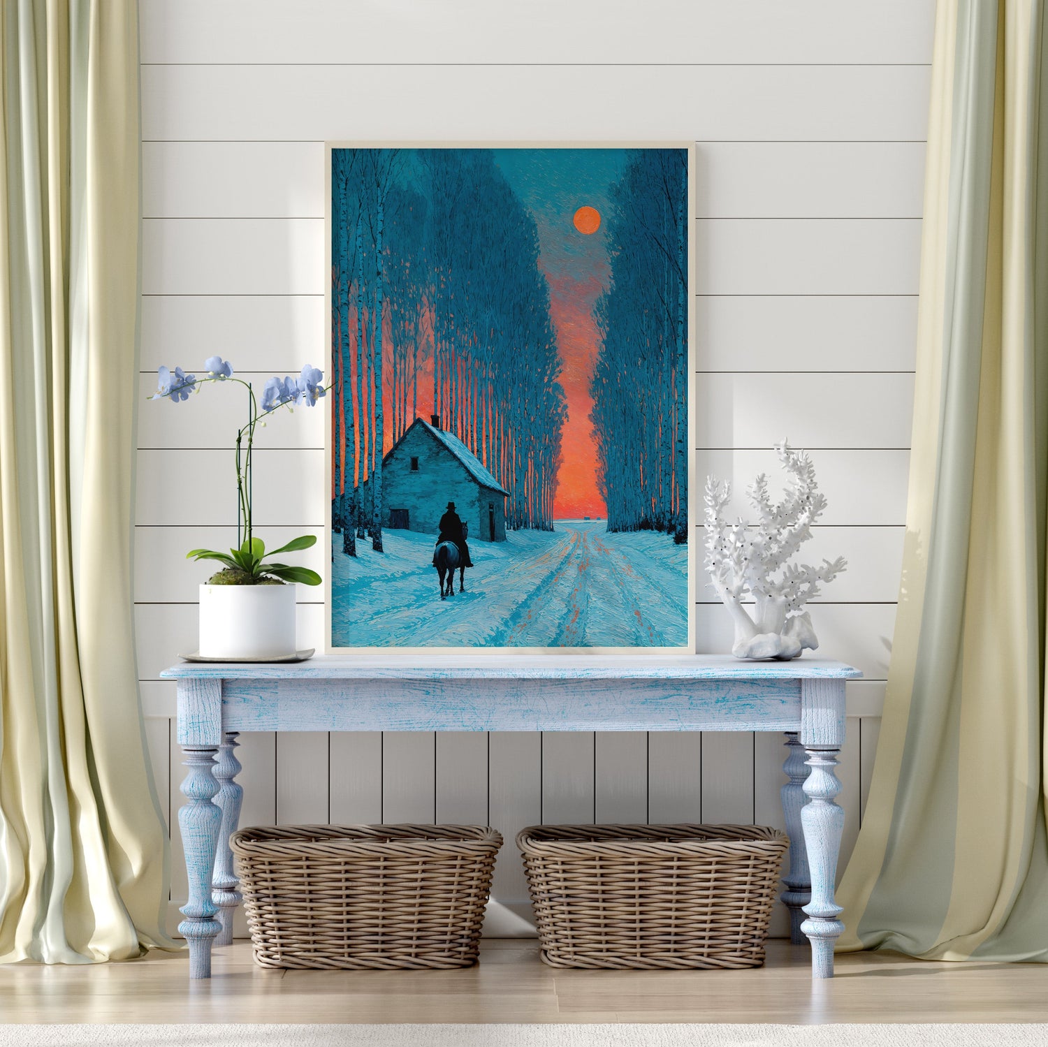
Kevin is great to work with. Always there to answer any questions about his products. My purchase of Crimson Moon came in a few days. Packaged well to eliminate the chance of damage. The colors are vibrant and printed on a thick paper. He even gave a free digital download of another print of his. If you like his art, you won't be disappointed with what you receive. I went with the 24 x 36 and I love it.
I loved all of Kevin's work that I saw but bought my favorite, Crimson Moon. It's extraordinary! The detail, dimension, depth and color usage is absolutely sublime. His work is very visceral to me and is an experience, not just a visual piece. When I can I will probably buy another of Kevin's work. I spoke to him and he was very friendly, very responsive, and was willing to guide me for exactly what I was looking for. The piece came on a canvas print that included the fine detail and quality that sometimes canvas prints lack. It was perfect.
I’ve been looking at Kevin’s artwork for a while and finally purchased an XL print of Crimson Moon. The quality is great and Kevin was very prompt in answering my email when I had follow-up questions about his art. Great experience overall.
Kevin did an amazing job customizing a print for me that created a stunning display in my kitchen. He was patient, accepting of honest feedback and timely in delivering the finished product. I plan to buy more of his beautiful artwork soon because his creative talent and his customer service is comparable in excellence.
I am a big fan of sunrises and full moons. The Luna print caught my eye when I saw it and had to have it. Ordering was seamless and I received my print very quickly. Thank you for your beautiful work!
The colors are beautiful. I am having it framed at this time.It is as beautiful as it was presented on the website.
Absolutely stunning! Excellent quality print, and exceptional customer service. Arrived quickly, undamaged and well protected. Would buy again!
Crimson Moon is absolutely gorgeous—high quality and even more stunning than I expected.
It took a little bit longer to get because of that horrendous 18” snowfall but it was worth waiting for!
I love the perspective on 'Stardust'. So creative and wonderfully imaginative!! ❤️
It's the feeling of calm I get when I look at it, the lighting make it positive, not sad. Someone that is comfortable been alone and thinking. Love it!!!
He does beautiful work. I've bought several pieces. Fast response. I look forward to seeing what else he makes.
I couldn’t be happier with my purchase. The prints exceeded my expectations and my father is absolutely thrilled with them. Kevin is incredibly kind and professional and goes the extra mile.
Vivid colors and amazing scene.
I just love this image! Can’t wait to get it framed. Working with Kevin was a treat, he is so responsive. Answered all my questions in record time. Went above and beyond :)
This was a gift for my daughter's friend. It was in the package with my daughter's, so I didn't personally see it yet. She absolutely loves the print. I can't wait to see both of them. I offered to frame both pieces, so I will hopefully see them soon.
“Lauritzen Garden” is pure joy in color. Vibrant, alive and beautiful. I’m in love with this piece.
I loved all the artworks! I purchased a print several months ago and I could not be happier with the quality and the breathtaking image. Customer service is exceptional and understanding of my request. I definitely recommend buying from here if you desire beautiful, breathtaking images!
Stunning artwork delivered right to your inbox to print at the size you desire. Exceptional customer care, included a bonus gift… highly recommend!
"Forgotten" is a beautiful art piece to go with the Still Water print I purchased. I love it
I received Panorama and I love it! It was packaged really well and arrived safely and I can’t wait to find just the right frame for it. Thanks so much!
The quality is great and the artist so quick to respond. Would definitely recommend!
Votre travail est d’une beauté inspirante, mêlant douceur et originalité. Merci de le partager et d’encourager ceux qui aiment créer. Merci également d’avoir répondu si rapidement et avec tant de gentillesse à ma demande. 🌹
The quality of the printed canvas is excellent, almost impossible to distinguish from a real painting.
This was actually a gift for my daughter. It arrived just after Christmas, so I gave her the package to keep safe until she frames it. She said it was gorgeous and can't wait to frame it.
I was very happy with the quick response to questions and am happy with the image. Shipping was smooth and quick. Just waiting to hang it. Thx Kevin
The colors are indeed bright. The print arrived lightening fast and wrapped in tissue paper. I cannot be more pleased with my purchase.
Great print and wonderful experience overall. The detail and atmosphere in this piece are incredible — will definitely be ordering again!
Kevin is an excellent artist, his works are really beautiful… Recommended for all lovers of art and beauty!
Beautifully done! The artwork quality and color depth exceeded my expectations. Shipping was smooth and everything arrived perfectly.
“Nebraska's Moonlight ” is absolutely beautiful.
“Still Water” is a truly beautiful print, serene and elegant.
It is a gorgeous high quality digital download. I was able to print it at home and I LOVE how it looks! I will definitely be getting more prints!
Another beautiful digital download. The print quality is amazing in multiple sizes.
Great quality paper, well packed. Super rendering 👌
This is such a unique painting! I was looking for something rainy themed to match what I already have. It’s stunning and printed perfectly through Vista!
The high quality of the art work and the paper. It is a real eye-catcher for our living room!
Best prints I’ve ever had, I'm very happy with this purchase, thank you Kevin!
Beautiful digital paintings and services.
Beautiful artwork and exceptional quality — I couldn’t be happier.
Clarity, color, composition — all fine!
This artwork just captured my heart! It is affordable and beautiful… Would highly recommend this shop!!
Beautiful picture. Arrived in perfect condition. Very reasonable shipping costs.
Love the painting and the printing and paper. Already a favorite.
I liked the picture “Imbalance” so much I painted it… Thank you Kevin for your beautiful artwork!
Composition, brush control, color management.
Brilliant color, high quality paper. Love this artist.
The lighting the colors the subject all stunning. You captured the moonlight and country road with the old truck so nostalgic!
Great colors! Vibrant and the mat texture is perfect!
Brilliant color, high quality paper. Love this artist.
I absolutely love your work. They are just beautiful. Thanks for making these available to other artists.
I absolutely love your work. They are just beautiful. Thanks for making these available to other artists.
The serenity and beauty of great addition for my gallery wall!
love this painting. It gives me peace. I don’t know why but I’m hanging it on the wall by my bed so it’s the first thing I see in the morning and the last thing I look at before I go to sleep 😊
Love the colors, just a sharp image.
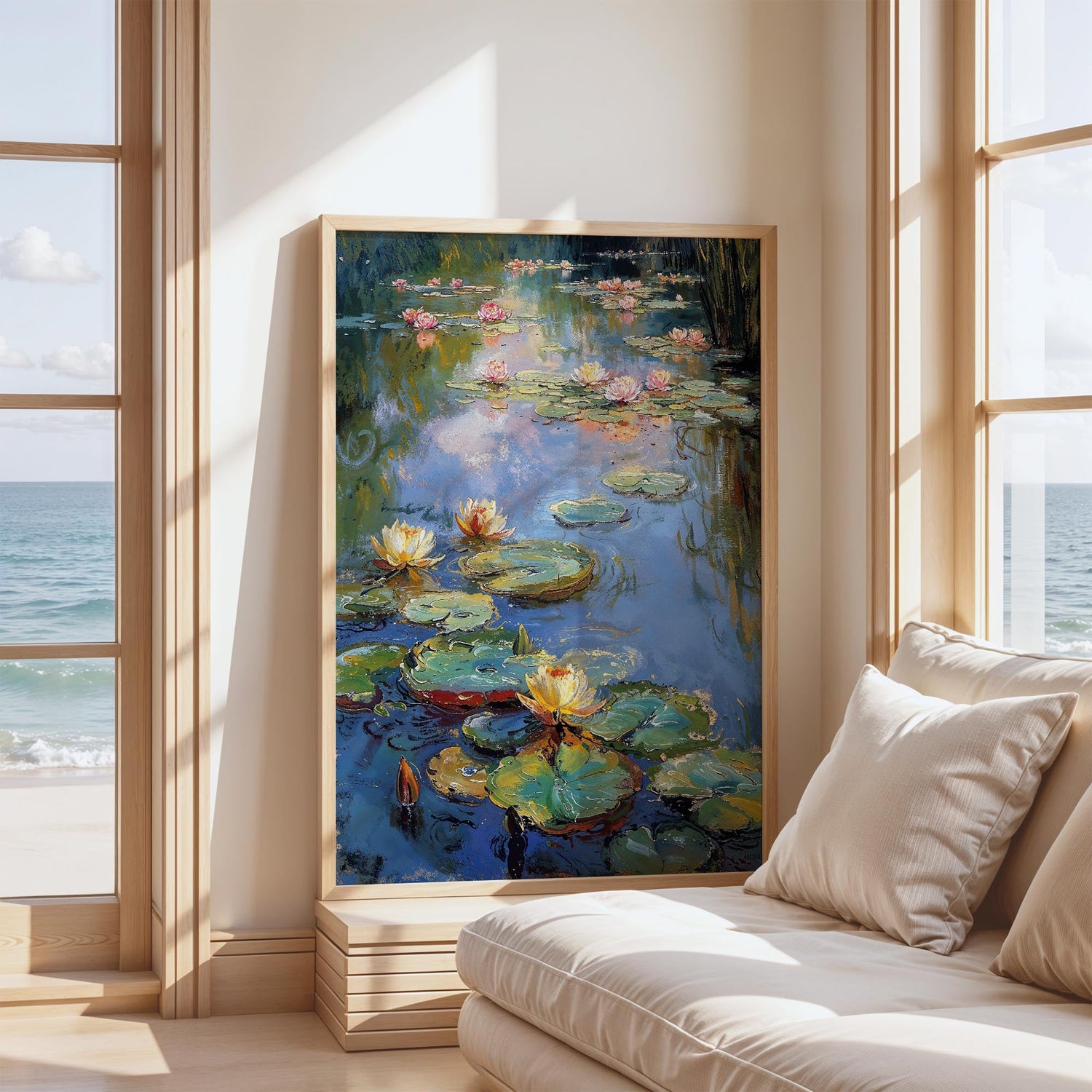
Always loved water lilies. A beautiful addition to my gallery wall
Cet art est vraiment magnifique, j'adore les paysages des quatre saisons, félicitations à vous Kevin Kia et longue vie ! ❤
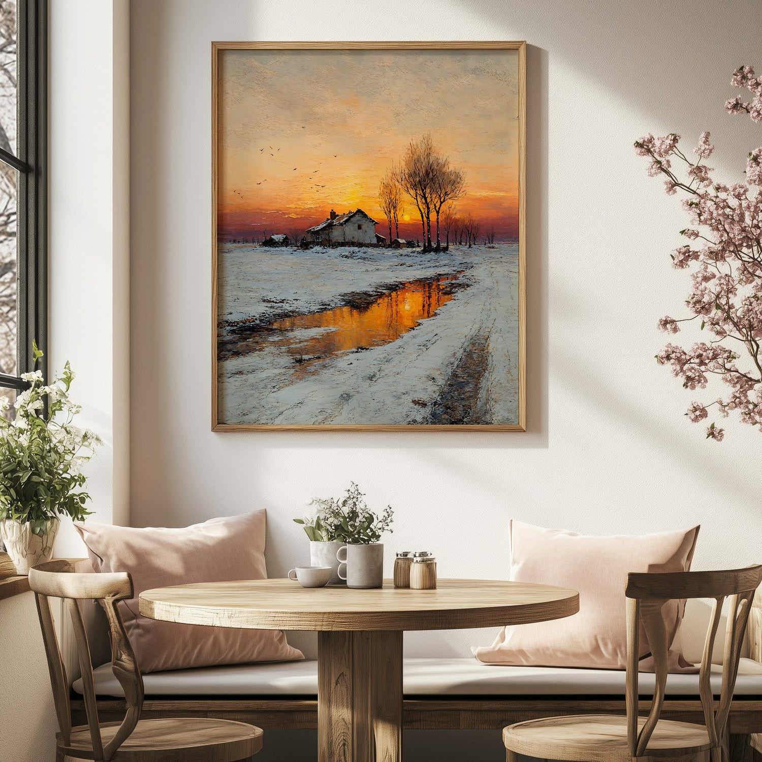
The winter image is beautiful giving off a warm glow that catches your eye as soon as you walk into the room.
Reminds me where I grew up in Nebraska
I can’t wait to find the perfect frame! Thank you!
It was a gift and they absolutely loved it!
Beautiful and better than the photo!
The whole thing. The vivid colors and the birches.
I love the color combination!
An Amzing and eye-catching artwork!
Love it!
I loved this picture the moment i saw it. Thank you!
Really loved it!
I love it. Can't wait to hang it after it is framed.
So beautiful and fits perfectly with my decor!
Crimson Moon is a great artwork! I am really happy with my purchase.
Just what I wanted. Thanks!
It's a beautiful print!

These fine art prints have captured hearts and homes, becoming timeless favorites...

These are the pieces we believe bring something extra special to any...

This curated selection features the latest fine art prints, freshly added to...
Reflections
In Art Academi, nature’s dreams take flight,
With strokes of wonder, we paint pure light.
Each piece a story, a timeless embrace,
Inviting serenity to fill your space.