

Blog Posts
Negative Space in Interior Design: Why Empty Walls Look Better
Learn how negative space around wall art improves visual hierarchy, how much empty wall to leave, and how to balance statement art, furniture, and gallery walls without relying on rigid spacing formulas.
 Apr 22, 20267 min read
On this page
Quick Answer
Negative space is the intentionally unoccupied area around artwork, furniture, and architectural features. In a room, it gives important objects room to stand apart, makes visual hierarchy easier to read, and can help a wall feel considered rather than crowded. There is no universal percentage of wall that must remain empty: the right amount depends on the artwork, furniture, wall dimensions, viewing distance, and the atmosphere you want to create.
A blank wall is not automatically an unfinished wall. In interior design, the open area surrounding an artwork can be as important to the composition as the artwork itself. This is negative space: the visual breathing room that separates focal points and helps the eye understand what matters first.
Used well, negative space can make a single print feel more intentional, give furniture and architecture clearer roles, and create a calmer visual rhythm. Used without enough attention to scale, however, an empty wall can simply feel unresolved. The goal is not emptiness for its own sake; it is balance.

What Is Negative Space in Interior Design?
Negative space is the area that is deliberately left unoccupied around the elements of a composition. On a wall, that may be the space around a framed print, between a picture and nearby shelving, or between separate groups of artwork. Across a whole room, it can also include open areas that keep furniture, lighting, decor, and art from competing with one another.
The idea comes from composition: the relationship between occupied and unoccupied areas affects how easily we perceive shape, hierarchy, contrast, and balance. An empty section of wall therefore has a job. It can separate visual groups, frame a focal point, or create a pause between areas of higher detail.
Why Visual Breathing Room Matters
Our attention is naturally drawn toward contrast, edges, color, faces, text, and other visually distinctive features. A room containing many competing elements gives the eye more possible focal points. That does not make a gallery wall or richly decorated room inherently bad; maximalist spaces can be deliberate and beautiful. But when every surface competes equally for attention, the composition can become harder to read.
Negative space helps establish hierarchy. Instead of trying to eliminate visual stimulation, it gives the strongest elements enough separation to be recognized as intentional focal points.

Wall-Art Density at a Glance
| Arrangement | Visual Character | Best Used When |
|---|---|---|
| Single statement piece | Clear focal point with generous breathing room | You want one artwork to anchor the wall |
| Structured pair or grid | Ordered rhythm with multiple related focal points | The works share scale, palette, subject, or framing |
| Dense gallery wall | Layered, energetic, visually active | The collection itself is intended to be the focal point |
How Artwork Becomes a Visual Anchor
A strong wall-art arrangement usually gives the eye a clear place to begin. A single larger work can do this through scale and contrast; a gallery wall can do it through a coherent outer shape, repeated spacing, or a dominant central work.
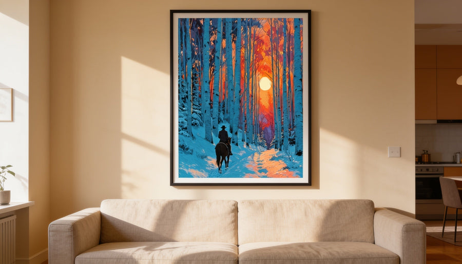
Open wall space strengthens that hierarchy by separating the artwork from unrelated objects. This is especially useful above a sofa, bed, console, or fireplace, where the art also needs to relate visually to the furniture below it.

For horizontal proportion, our 2/3 wall art sizing guide explains how artwork width can relate to sofas, beds, consoles, and grouped arrangements. For vertical placement, see the wall-art hanging height guide.
How Much Empty Wall Space Should You Leave?
There is no reliable universal rule that says a fixed percentage of every wall must remain empty. A useful approach is to judge the relationship among the artwork, the furniture it belongs with, and the remaining wall rather than calculating negative space as a standalone percentage.
Start with these practical checks:
- Relate art to the furniture below it. Artwork that is too narrow can look disconnected even when plenty of wall is empty.
- Keep unrelated objects from crowding the focal point. Lamps, shelves, mirrors, plants, and neighboring frames all contribute to perceived density.
- Consider viewing distance. A large wall seen from across a room can support a larger composition than a narrow hallway viewed at close range.
- Use grouping deliberately. Several pieces with consistent spacing can read as one composition rather than as unrelated clutter.
- Test before hanging. Painter's tape or paper templates can show the occupied area and the surrounding breathing room before you make holes in the wall.

Using Negative Space in Different Rooms
Living Room
Above a sofa or console, begin by making the artwork feel connected to the furniture rather than floating independently on the wall. Once the scale relationship works, preserve enough open area at the sides and above the composition that nearby decor does not compete with it.
Bedroom
A bedroom often benefits from a simpler focal hierarchy. One work or a restrained pair above the bed can create a strong center without requiring every adjacent wall to be decorated.
Hallway or Entry
Narrow spaces are usually viewed at shorter distances, so visual density can build quickly. A sequence of works can still succeed, but consistent spacing and a clear alignment make the arrangement easier to read.
Home Office
Consider both the view from the desk and what appears behind you on video calls. Open wall area can keep the background from competing with your face while still allowing one or two pieces to give the room character.
Do Gallery Walls Need Negative Space?
Yes. Negative space does not mean using only one artwork. In a gallery wall, the gaps between frames and the open wall around the outer boundary of the group become part of the composition. Consistent spacing can make many individual works read as a unified arrangement.
If the goal is a lively, collected look, a denser arrangement may be appropriate. If the goal is a quieter room, fewer pieces or a more restrained grid may work better. Neither approach is universally superior; the important question is whether the density supports the intended character of the space.
For a step-by-step approach to grouping multiple pieces, see our gallery wall planning guide.
Common Negative-Space Mistakes
- Treating empty wall as a formula. Fixed percentages cannot account for wall proportions, furniture, artwork orientation, or viewing distance.
- Choosing art that is too small. More empty space does not compensate for an artwork that feels disconnected from the furniture or architecture.
- Spacing every object evenly. Good hierarchy often comes from grouping related elements and leaving larger pauses between groups.
- Assuming minimalist is always calmer or better. A successful maximalist room can be coherent when color, repetition, alignment, and spacing create structure.
- Ignoring the whole room. Negative space is affected by shelves, windows, doors, lighting, plants, textiles, and furniture—not only by the framed art.
Frequently Asked Questions
What is negative space in interior design?
Negative space is the intentionally unoccupied area around furniture, artwork, decor, and architectural features. It helps separate visual groups and can make focal points easier to recognize.
Does negative space mean leaving walls blank?
No. It means using occupied and unoccupied areas deliberately. A gallery wall can contain negative space between frames and around the overall arrangement, while a single artwork may use a larger open area around it.
How much empty wall space should I leave around a picture?
There is no universal percentage. Start with the artwork's relationship to nearby furniture, then consider the wall dimensions, neighboring objects, viewing distance, and the visual character you want. For art above furniture, proportion is usually more useful than a fixed empty-wall percentage.
Can a room have too much negative space?
Yes. If artwork is undersized, isolated from the furniture, or lacks a clear relationship to the architecture, an open wall can feel unfinished rather than intentional. Negative space works best when the occupied elements are strong enough to anchor the composition.
Final Thoughts: Leave Room for the Art
Negative space is not a requirement to decorate less. It is a way to compose more deliberately. The open wall around an artwork helps define its scale, separates it from competing objects, and gives the room a clearer visual hierarchy.
Rather than chasing a fixed percentage or a universal maximum print size, judge the wall as a complete composition: artwork, furniture, architecture, neighboring objects, and the space between them. When those relationships feel intentional, an empty area stops looking unfinished and starts doing useful design work.

Art worth living with


