

Blog Posts
Matte vs Satin vs Glossy Prints: The Best Finish for Wall Art, Photos, and Framed Prints
A practical guide to choosing matte, satin, or glossy print finishes for wall art, photo prints, posters and framed artwork, with advice on glare, room lighting, scale and framing.
 Feb 23, 20268 min read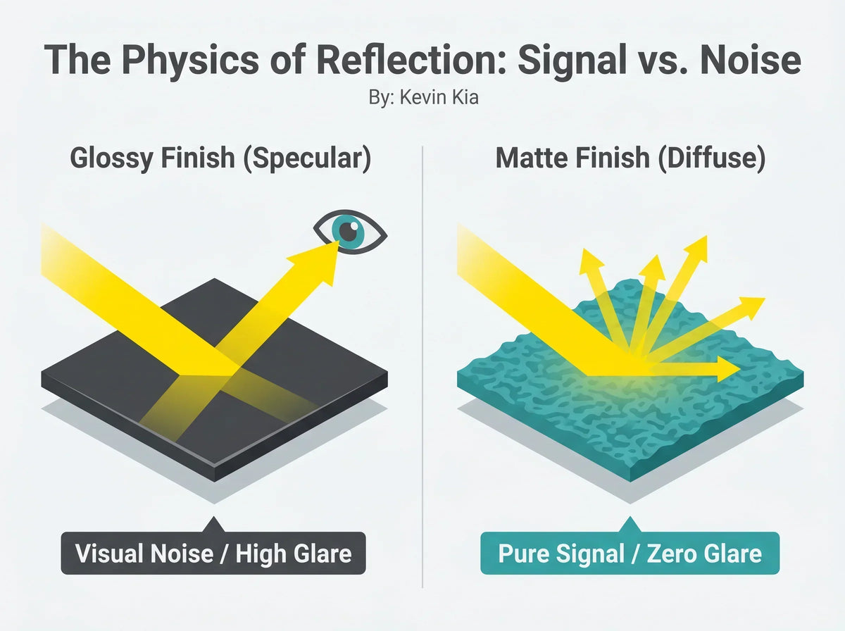
On this page
Quick Answer: Which Print Finish Should You Choose?
For most wall art, matte is the safest starting point because it keeps reflections subdued and lets the image stay readable from more viewing angles. Satin is a useful middle ground when you want a little more surface sheen and color punch without the strong reflections of a glossy print. Glossy works best when maximum sheen is intentional and the lighting is controlled.
The best finish depends on four things: the artwork itself, the size of the print, the room lighting, and whether the piece will sit behind glass or acrylic.
Matte vs Satin vs Glossy: Quick Comparison
| Finish | Reflection level | Visual character | Usually best for |
|---|---|---|---|
| Matte | Low | Soft, calm, gallery-like | Large wall art, bright rooms, framed fine-art prints |
| Satin | Moderate | Balanced sheen and depth | Photography, colorful prints, dimmer rooms |
| Glossy | High | Shiny, high-contrast, vivid | Small photos, albums, controlled display lighting |
Matte controls reflections best, satin balances sheen and glare, and glossy gives the strongest shine.
Best Print Finish by Use Case
A finish that looks attractive under studio lights can behave very differently in a living room. Windows, lamps, ceiling lights, viewing angle, and glazing all change how the surface appears.
| Use case | Recommended starting point | Why |
|---|---|---|
| Large wall art | Matte | A large reflective surface is more likely to catch windows and room lights. |
| Framed wall art | Matte or satin | The glazing already adds another reflective surface. |
| Color-rich artwork | Satin or matte | Satin adds some sheen; matte keeps the presentation quieter. |
| Photo prints | Satin | It can preserve a lively photographic look while limiting stronger reflections. |
| Small prints or albums | Glossy or satin | Smaller pieces are easier to tilt away from reflections. |
What Causes Glare? Specular Reflection
Glare becomes noticeable when light from a window, lamp, or ceiling fixture reflects from a smooth surface toward your eyes. A glossy coating tends to preserve a stronger directional reflection, which is why a bright window can appear as a distinct hotspot on the print.
This effect becomes more disruptive as the artwork gets larger because there is more reflective area available to catch the room. It is also more obvious when the artwork hangs opposite a window or near a bright lamp.
Glossy prints can show more of the room. Matte prints keep more attention on the artwork.
How Matte Paper Reduces Reflections
Matte paper has a surface that scatters incoming light across a wider range of directions instead of sending as much of it back in one concentrated reflection. The result is a softer surface with fewer hard hotspots.
This does not mean a matte print can never reflect light. Any surface can show some reflection under the right conditions, and glazing can still become the dominant source of glare. But compared with a glossy print, a matte surface is usually much easier to view in normal home lighting.
For Art Academi prints, a matte fine-art presentation also pairs naturally with textured archival papers. If you want to understand the material itself, see our guide to cotton-rag fine art paper.
Matte vs Glossy Art Prints: The Practical Difference
| Feature | Matte | Glossy |
|---|---|---|
| Glare | Lower | Higher |
| Viewing from angles | More forgiving | More dependent on room lighting |
| Surface character | Soft and restrained | Shiny and vivid |
| Typical wall-art use | Large art and framed prints | Smaller photos or controlled displays |
Glossy can look striking when the lighting is controlled, but homes are rarely controlled environments. Daylight moves, lamps turn on and off, and viewers approach the artwork from different directions. Matte is often the more forgiving wall-art finish for those conditions.
Satin vs Glossy Photo Prints
Satin sits between matte and glossy. It has more sheen than matte, but it does not create the same mirror-like surface as a high-gloss print. That makes satin a strong option for photography, especially when you want lively color and tonal depth without making reflections the dominant visual feature.
Choose satin when the print will be displayed on a wall, viewed from several angles, or placed in a room with moderate ambient light. Choose glossy when the shine itself is part of the desired look and you can control the light source.
Best Finish for Framed Wall Art
Framing changes the decision because glass or acrylic adds another reflective surface in front of the print. A glossy print behind reflective glazing can create two layers of shine. A matte print behind good glazing usually gives a calmer presentation.
For large framed artwork such as 18×24, 20×30, or 24×36, the finish and glazing should be considered together. Our acrylic vs glass framing guide explains the trade-offs in more detail.
Matte vs Glossy Poster Prints
For posters used as home decor, matte often feels more refined because the surface itself does not compete with the image. Glossy posters can look bright and punchy, but strong room reflections may make them feel more commercial or harder to view from the side.
Satin is useful when you want a little more visual energy than matte without committing to a full glossy finish.
Finish Decision Chart for 24×36 Prints
Large prints amplify every surface decision. A 24×36 piece cannot be tilted in your hand the way a small photo can, so the finish needs to work with the room where it will actually hang.
| Room condition | Starting finish | Reason |
|---|---|---|
| Bright living room | Matte | Helps reduce window and lamp reflections. |
| Bedroom or nursery | Matte | Creates a softer, quieter surface. |
| Dim hallway | Matte or satin | Satin can add presence if reflections are limited. |
| Photography wall | Satin | Balances color depth with lower glare than glossy. |
| Controlled studio wall | Satin or glossy | Stronger sheen is easier to manage when lighting is intentional. |
For placement, pair the finish decision with scale and hanging height. See our wall-art proportion guide and 57-inch hanging-height guide.
Best Finish and Framing Pairings
A print finish is only one part of the display system. Paper, ink, matting, glazing, frame depth, room light, and viewing distance all affect the final result.
| Desired look | Finish | Display approach |
|---|---|---|
| Calm gallery presentation | Matte | Fine-art paper with low-reflection glazing |
| Color-rich photography | Satin | Smooth paper with carefully chosen glazing |
| High-shine display | Glossy | Use where reflections can be controlled |
| Long-term fine-art presentation | Matte | Archival paper, pigment ink, acid-free framing materials |
Finish alone does not determine longevity. Paper stability, ink chemistry, light exposure, and framing materials matter too. See our fine-art print quality guide for the full system.
Why Reflections Can Make Artwork Harder to View
A bright reflection competes with the image because the eye is drawn to strong highlights and contrast. When a lamp or window sits directly over the artwork visually, the viewer has to look through that reflection to read the image underneath.
Reducing those hotspots can make the artwork easier to see from more positions in the room. That is one reason matte finishes are so useful for living rooms, hallways, bedrooms, and other spaces where lighting changes throughout the day.
Why Matte Prints Can Still Look Rich and Deep
Matte does not have to mean dull. A good matte print can still reproduce strong color, deep shadows, and subtle tonal transitions. The difference is that the surface contributes less shine, so the visual impact comes more from the image and printing quality than from reflected light.
High-quality pigment printing on an appropriate fine-art paper can produce a rich, tactile result without requiring a glossy coating. If archival performance matters, also read our guide to pigment inks and light exposure.
Where Matte Makes the Biggest Difference
- Opposite windows: strong daylight reflections are harder to avoid on shiny surfaces.
- Above sofas: lamps and windows behind the viewer can reflect directly into the artwork.
- Hallways: viewers approach from changing angles, making reflective finishes less predictable.
- Large statement walls: more surface area means more opportunities for glare.
- Rooms with ceiling lights: overhead fixtures can create bright hotspots near the upper portion of the print.
Common Print-Finish Mistakes
Choosing glossy for a large wall piece without checking the room
A glossy sample may look dramatic in hand but become distracting once enlarged and placed opposite a window.
Ignoring the glazing
Even a matte print can reflect strongly if it sits behind highly reflective glass or acrylic.
Choosing finish only for color intensity
Color matters, but viewing conditions matter just as much. Satin can often provide a useful compromise when matte feels too subdued and glossy feels too reflective.
Assuming glare cannot be improved
Finish, glazing, placement, and light direction all give you ways to reduce distracting reflections.
Frequently Asked Questions
Is matte, satin, or glossy best for wall art?
Matte is usually the strongest starting point for wall art because it keeps reflections lower and remains easier to view from changing angles. Satin is a good middle ground. Glossy works best when you intentionally want a shiny finish and can manage the lighting.
Is satin or glossy better for photo prints?
Satin is usually more forgiving for displayed photographs because it keeps some sheen while reducing the strongest reflections. Glossy can give a more dramatic shine in controlled lighting.
What finish looks most premium for framed wall art?
For many fine-art presentations, matte creates the calmest gallery-like look, especially when paired with quality paper and thoughtful glazing. Satin can also look premium when a little extra sheen is desired.
Should colorful art be matte or satin?
Both can work. Matte creates a quieter surface; satin adds more sheen and can make color feel slightly more energetic.
How do I reduce glare on framed artwork?
Start with a lower-reflection print finish, choose appropriate glazing, avoid placing the artwork directly opposite a bright window, and adjust nearby light sources so reflections are not aimed toward the normal viewing position.
Matte, Satin, or Glossy: the Final Choice
For most large wall art and framed fine-art prints, matte is the most dependable choice because it keeps the surface visually quiet and works well in changing home light. Satin is the flexible middle option when you want more sheen without the strongest reflections. Glossy is a specialized choice for situations where high shine is intentional and lighting can be controlled.
Choose the finish after considering the artwork, print size, room lighting, and framing system together. That produces a better result than choosing the surface in isolation.

Art worth living with


